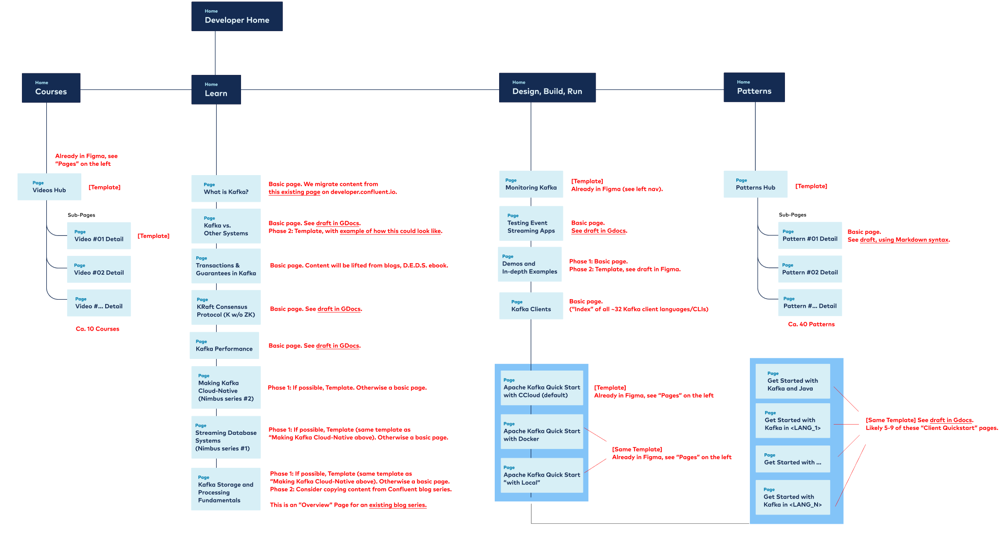
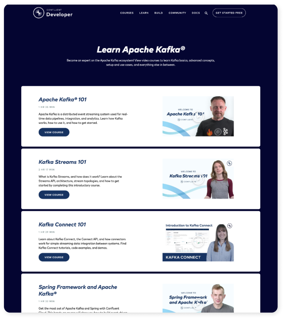
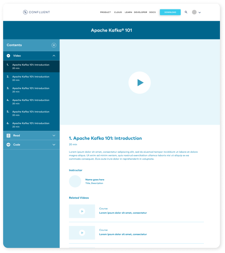
Confluent Developer
Ongoing
Confluent Developer is the developer focused site supporting confluent.io. We have thousands of developers in all skill levels who use open source Apache Kafka and visit our site. Since we are the original creators we want to be the one stop shop for all your Kafka needs —from support, to community and integration.

This site is hundreds of pages and multiple templates, we'll be focusing on the main homepage.
My role: Designer
.
Industry
Enterprise SAAS
Goal
Create a single home for apache kafka learning
Team
2 designers, 1 PM, 3 engineers, content partners
Pain point
Confluent creates enterprise features built on open source apache kafka, the primary users are developers and at the time there is no comprehensive one stop shop for our developer community. Resources were scattered everywhere, documentation was it’s own micro site, and tutorials were piecemealed on youtube.
Challenges
1. Use imagery to explain abstract technological concepts

2. Organize massive amounts of content into micro hubs; courses, quick starts, patterns

3. Create a clear and concise navigation between topics
User stories
I am a developer and I’d like to look at documentation to solve a current coding challenge
I am a developer and I’d like to find a kafka 101 course to learn the fundamentals
I am a developer and I’d like to learn how to join the community and find a meetup near me
I am a developer and I’d like to learn to get started in Python or maybe C++
Original design
The original “developer hub” was a page on confluent.io, it had very limited information. There were only a handful of tutorials, resources and community touchpoints. According to metrics it was not a very visited or used page. We had a few theories on if the content was not deep enough, if the page was hard to find or maybe people just got tired of the static information.
First steps
The opportunity to grow this page is huge. We decided it should live on its own and it should be its own microsite. The content teams spent tons of time creating videos, tutorials, documentation guides and more so we’d have enough content for a full microsite. To organize and map everything out we started with a sitemap and built out the bones from here. This helped everyone get aligned on what we were offering, where and what would live under it.
17

Tracks

204

Video Tutorials

8

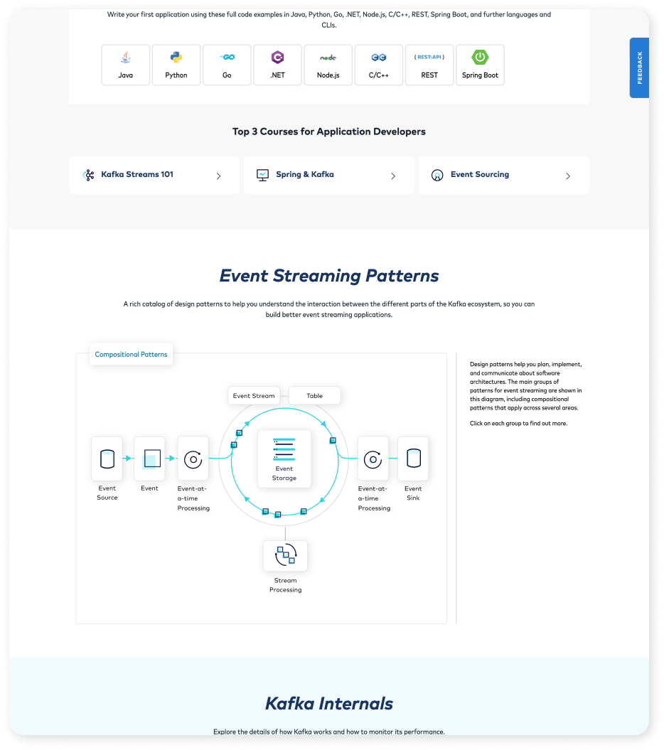
Programming Languages

52

Patterns

14

FAQ Topics

1

Community

1000+

Documentation pages

High fidelity mocks
Homepage | 3 interactive diagrams
The new homepage features 3 interactive diagrams to help users understand complex topics without having to click out onto another page: Event streaming, patterns, and Kafka internals. Each section of the page was meant to be a jumping off point into another part of the site.
Original homepage
Revised homepage
Middle section
Courses | 200+ videos
Our video series are broken up into 17 “tracks” each track hosts ~12 videos on that specific topic. We created these pages to help increase engagement and keep the users on these pages for as long as possible. Once you’re in a track you can navigate in page to other subsequent videos within view. The main content area can accommodate supporting graphics, code blocks and text that go along with each video. Often our courses were advertised on LinkedIn or in other blogs which drove traffic here, and once here our goal was to keep them in the experience if possible.
Video wireframe
Video hub page
Video detail page
GETTING STARTED GUIDES | 8 languages & 2 subnavs
Our getting started guides had 2 subnavs one that accommodated 8 supported languages and another that acted like an accordion (the left rail). Once a language was selected the content changed and was navigable on the left rail. We designed this to be a single view so user can consume a lot of content and not having to worry about being sent to new pages. The left rail design paradigm was added in a few other places on the site and even influenced the design of the .io site, it became a core component for our developing design system.
Get started wireframe
Get started main page
Get started detail page
PATTERNS | 50+ patterns
We are very proud of our pattern library at Confluent. We added 50+ patterns for developers which help establish a common language, and enumerate the foundational components needed to build more complex systems. We used the left rail component here to help organize all the content and keep everything in one view. The content area can hold anything from graphics to code blocks.
Pattern wireframe
Pattern home page
Pattern detail page
Results
After launching this new developer microsite, it was met with massively positive reviews internally and externally. It met and exceeded projected benchmarks resulting in 60k+ pageviews, 300% increase in product signups, and 60% more product-led growth and influenced signups. It was a huge step forward from where we began, and we finally had a central place for Apache Kafka learning.
Retro
While the launch of the microsite was a huge cross functional effort it came with its own challenges. Throughout the process we had changing content, priorities, navigational structure and design iterations which made it hard to deliver a truly seamless experience throughout the whole microsite. We had limited time to explore design patterns and had to shift and accommodate when UI/UX bugs came up. We utilized our component system as much as possible to help cut down some time but if we could do this over, we’d bake more design research, exploration and testing into the process. We designed and developed the whole site in roughly 6 months.
60%

Increase in product-led growth and influenced signups

300%

Signup increase in the first month

60k+

Pageviews in the first month

Developer V2
With this redesign we were able to learn from the previous one and advocate for more design time and research. We put together a more concise user persona and did more research beforehand. We know that most entrances to developer.confluent.io are organic with smaller percentages being through referrals, video, and social paid ads, this told us that people are searching Apache Kafka and they’re looking for specific content.
Context
About a year later, once the dust settled from the initial microsite launch, we decided the site needed a refresh. Our goals for the microsite have shifted with new leadership and the design needed to accommodate for this. Leadership wanted to shift the microsite in 3 ways:

1. Reposition Confluent Developers site to be THE Kafka site
2. Restructure the content of the site, including integration of docs
3. Integrate with Confluent Cloud

Brief feedback
Some of the feedback from developers were that the current homepage wasn’t resonating anymore. The diagrams have too much information and are a bit too detailed. The page was long and overall, it wasn’t adding much value.
User persona
Confluent has a well-defined developer persona that we utilized for this project; I call him Sean. Sean is focused on shipping quality code and learning how to implement Kafka to build an application. He needs clear navigation and beginner’s content. His goals are to identify what Kafka is, how to use it, and how to get started. He is motivated because he wants to demonstrate that he knows Kafka and he knows how to develop for it. He wants to be “in” the Kafka community. “As a user I want to understand what Kafka is and how to implement so I can use it for my business” To address this persona, we specifically laid out the site, so it was quick to consume and easy to digest. It includes a language selector to make it easier to implement in your native language, an animated diagram to visually illustrate how Kafka operates, and numerous accompanying diagrams to explain additional content.
First designs
To solve our target customer’s pain point we thought using an animation would help convey what Kafka is and how it works. This animation is the focal point of the page and a lot of design focus went into that. We got mixed feedback on the first two iterations which caused us to go back to the research phase and come at this from another angle. These first two page iterations were also focused on establishing the user flow and interactions on the page.
Research, again
Because the animation became the focal point of the page, we needed to circle back to the research phase. We researched how other companies were showcasing their products and if applicable any animations that went with that. We worked with our key stakeholders to get feedback and initial thoughts on the research so we could narrow down the direction we should go in. We then put together a hybrid of iteration 1 & 2 as well as options that were inspired by imagery we pulled.
Main image iterations
The structure of the page was given the green light, so the majority of the time was spent on perfecting the main animation. We wanted Kafka to be the biggest and most prominent in the center and some of the services we connect to are circled around. Each service should have a road that connects to Kafka where dots will move back and forth illustrating data moving. I created a Protopie animation to give the developers a better idea of how we want the timing to animate with the content.
We tried to keep the main blue building and incorporate the terminal on the right. I added back more info to each hub
Dark version of the illustration on the left
I tried a more isometric illustration here with the buildings surrounding the main square
We shortened the center circle and shortened the buildings. I made the roads a color to match their icons
Tried out something unique here with a pyramid in the center and more vertical buildings around
To increase contrast we tried a dark version with simple shapes and taller building in the center
Final design & design decisions
After working with engineering and stakeholders we landed on an image and page layout. This is the approved design, each section is interactive with tabs / buttons to click on to reveal or hide specific content, and the main image animates which showcases how Kafka works.
One stop shop
With a clear header we are letting the user know, if you are looking for Apache Kafka this is the place youshould be. The code selector dropdown helps the newbie get started in their language of choice.
Time on page
The decision to have the illustration peeking out from above the fold is to help indicate more content is below but to also catch your eye so you’re less likely to immediately bounce off the page. This is to help increase time spent on page.
How to use Kafka
We want to increase time on page by including more content that is relevant to the user and helps explain how to use Kafka. We added tabbed information for each section to keep the ux simple but also can reveal lots of content if the user is interested.
Continuity
Subsequent illustrations were created to match the main hero illustration to establish continuitythroughout the experience
Results
This page is still in development / testing, and results will be recorded after. We are keeping an eye on influenced signups and time on page.
Review
This redesign took some time when we got into a loop iterating on the diagrams. Overall, it was a seamless experience from design to dev and the feedback from stakeholders was critical in getting us to the finish point. We did internal testing with other engineers that also helped shape the outcome of the diagrams.