SOS
2018
Care package delivery app for every mood.
MY ROLE: DESIGNER
The Process

Double diamond approach

Timeline

3 Months

Highlights

40 screens made
5 user testing sessions
2 testing rounds
6 prototypes made

Tools

Figma
Pen and paper
Optimal workshop
Protopie

PROBLEM
When I send care packages to friends, I’m usually guessing what they’ll like. I would like a way to remove the guess work and make sure they’re getting stuff they actually want.
.
SOLUTION
Create an app where the user can send care packages for different moods to themself and their friends. The care packages are customized by the recipient, removing any guess work from the sender.
Design framework
Beginning any design project I use the framework of the 5 W's. By using this method I can get a better picture of how to solve this design problem and how to solve it successfully. Asking why helps understand the goal, asking who helps define the audience, asking where helps me understand the flow/context, asking what clarifies the deliverable. We also asked questions about the users, how they were getting here, did they interact with the app at all, did they order, how long until they left? We aimed to understand the pain points and areas for opportunity for our users.
Why is this important?
I’ve had friends going through a rough time and I’d want to send them something, so they know I care, but I wanted to make sure they liked what I sent them. This benefits the recipients by making sure they get something they like, and this benefits the senders by removing the guess work and saving money.
What problem are we trying to solve?
Removing the guess work out of what to send in a care package, plus a quick delivery time
What is the customer’s high-level motivation for solving this problem?
High level motivation is to let someone know that they’re thinking of them, or to recover oneself from trigger events
What is success?
• Ease of use / time needed to place an order
• Speed of delivery
• Adoption
• Number of active packages per user
• Customer satisfaction
Who is our audience?
24-35 year old millennials who have some disposable income with friends spread out in location and/or parents who have a child in college or living out of the house
When/where do they interact with this product?
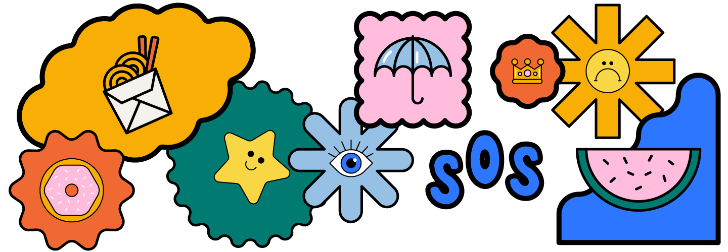
Each event is a potential trigger; date night, hangovers, sickness, finals etc. Triggers should occur on the date of delivery.

Users can be laying in bed, sitting on the couch, out and about
How does this influence the design?
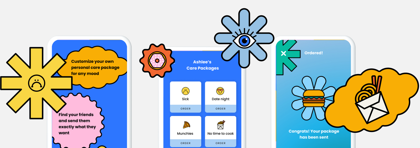
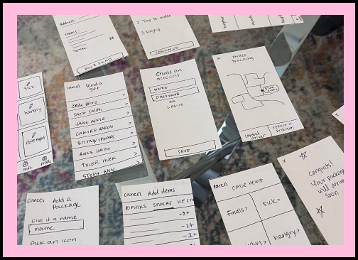
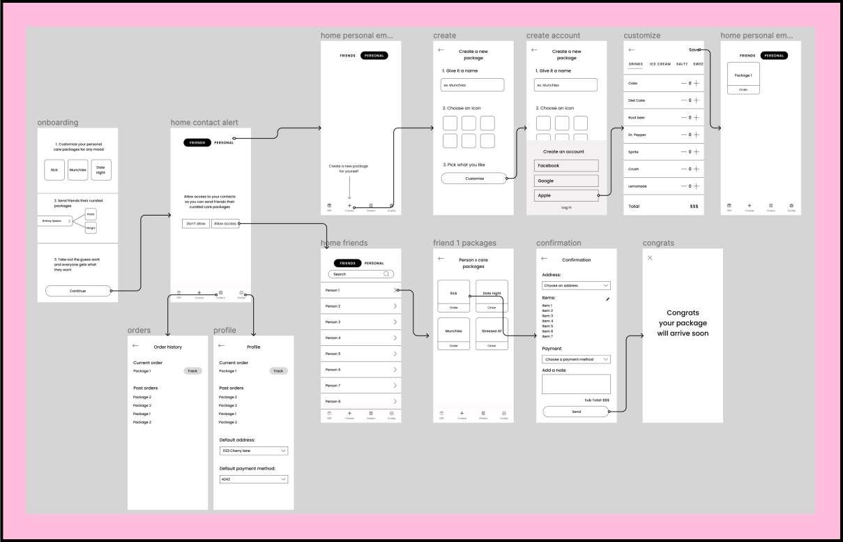
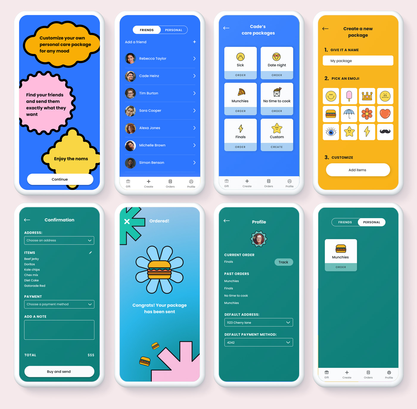
Because users can be doing a variety of tasks we wanted to make the ux as simple as possible to order a package. Easily search for your friends, see their packages and tap to order.

To minimize first time user drop-off and increase time to value, we have included an option to create an account or just explore while logged out. If a user wants to send a package they’ll be prompted for login, but they can still explore the app without signing in. Asking a user to create an account and enter payment details upfront can be a turnoff. I believe this can keep people in the app longer, get them invested and then provide contextual information when we want them to enter their credit card details or address.

Customer satisfaction will need to be measured by in app rating metrics after a purchase or after a delivery.

Ease of use will be evaluated by customer feedback, and hotspot / tap tracking
Personas & Storyboard
.

Cade the collage student

GOALS
Get snacks he likes delivered
MOTIVATIONS
Cade is stressed and doesn’t have time to do anything but study. He wants some quick fuel to keep him going.
NEEDS
Needs a way to choose what he likes Needs it delivered in less than an hour Needs it affordable
Demographics
Age:
20
Occupation:
Student
Location:
Dorms
Income:
Has some disposable income, funded by his parents
Tech:
Familiar with how to use technology and apps

Mary the mom

GOALS
Send a care package to her son
MOTIVATIONS
Mary wants her son to know she’s thinking of him even though he’s far away. She wants to provide some motherly comfort
NEEDS
Needs to know what he wants Needs a way to get him treats delivered Needs a super simple interface
Demographics
Age:
50
Occupation:
Mom
Location:
Los Angeles
Income:
Middle upper class with disposable income
Tech:
2/5 tech savvy
.
.
Empathy map
To create an empathy map that can be applied to the end users, I surveyed a few parents and asked them if they’ve ever sent care packages to their college kids. All of them had sent at least 1 care package and their experiences were majorly similar. One stood out though because her sons college provided a “package” of 4 care packages a year and the parents don’t have to choose or send because the school takes care of that. However, her son didn’t like the packages because he eats healthy, and the care packages were mostly junk food. I took the things she said, felt, did and thought and mapped them out below, and applied these learnings toward the initial designs.
Storyboard
Mary:
As a mom I want to send a care package to my son so he knows I’m thinking of him.
.
Lo-Fi testing
Using some lo-fi paper prototypes, I ran through the flow with a few people. It immediately became clear to me that what I thought was an intuitive design, it confused them. I asked them to complete a primary task and 4/5 couldn’t do it. After talking with one of the testers they proposed an updated flow that highlighted sending packages to friends over creating your own. This was a brilliant idea because it puts my differentiating factor front and center and accurately targets my biggest segment of users. These sessions helped force me out of a design bubble and to refocus on the users.
FEEDBACK
The proposed flow focused on creating care packages for yourself and ordering them for yourself. This was catered to the Cade persona, but after talking it through with some testers it seems like the idea might be better suited for the Mary persona. Ordering care packages for friends who already have them defined. Everyone I tested on assumed that creating a package would automatically be one you send to a friend. It wasn’t intuitive that the ones you create are for yourself. I need to shift the design to be focused on your friends rather than yourself.
Revised user flow
High fidelity designs
After getting feedback from testers on the flow and layout I went through and redesigned all the screens. I created a Friends and Personal toggle, putting Friends as the default. This way the user can quickly see their friends whom they can buy packages for. Personal is secondary because I learned that most users will likely be sending packages for others rather than to themselves. The whole app is discoverable while logged out until creating a package for which you then need to create an account. I chose to have a logged out experience because this will increase time to value and when a user is prompted for log in, it’s with contextual awareness.
Testing Round 1
The consistent feedback I got with this first round of design was that the navigation was confusing, the buttons didn’t look like buttons and overall people were confused and lost in the app. All the test results failed which indicated to me there was some serious design flaws. Even the most basic of tasks was failing. So I scrapped that design and worked on a new approach and new UI/UX. These test results came back as successes so I know that we’re visually headed in the right direction.
Testing Round 2
I put the focus on sending packages front and center and creating your own packages as secondary. This naturally shifted the user flow to one that was more clearly aligned with my testers expected flow. I tried to make things more obvious in this second round of design with specific labels like “order” and “create” along with empty state prompts. The results were a lot more positive, and it seems like it’s working. I’ll continue to validate these findings when I test a high-fidelity prototype
Protype
This design process of lo-fi, testing, hi-fi testing has helped shape the UI and UX of this app. I created a prototype using Protopie which highlights a first time use experience. The journey begins with onboarding and moves into loading contacts, choosing a friend to send a package to, and then ordering one of their pred-defined packages. Then navigating over to the personal tab we can create our own package for ourselves.
Takeaways
Challenge
This app has been a challenge for me because what I thought was intuitive, when tested, was not intuitive to users. I had to reframe the app’s main goal from sending myself care packages to sending friends care packages. I explored two very different use cases and learned that parents sending their kids care packages or peer to peer sending had a bigger market value than self ordering.
What's next?
Additional testing and validation, get a high fidelity prototype tested by users, then hand off to developers