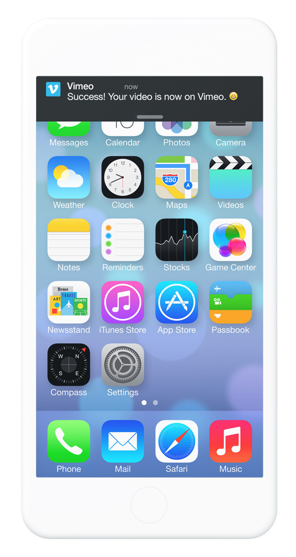
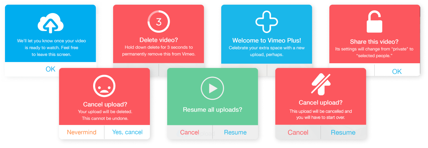
Alerts
Brand new features
Devices
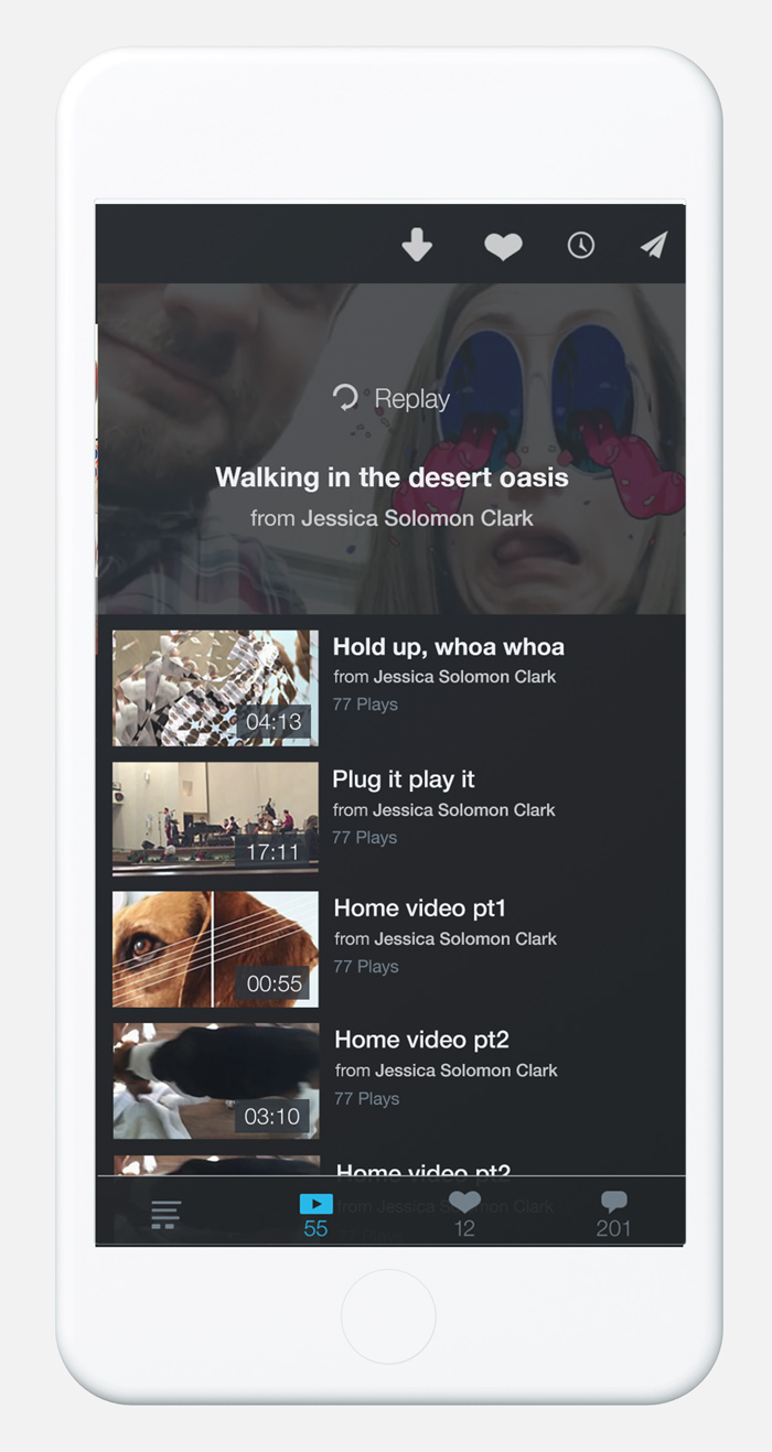
Screens
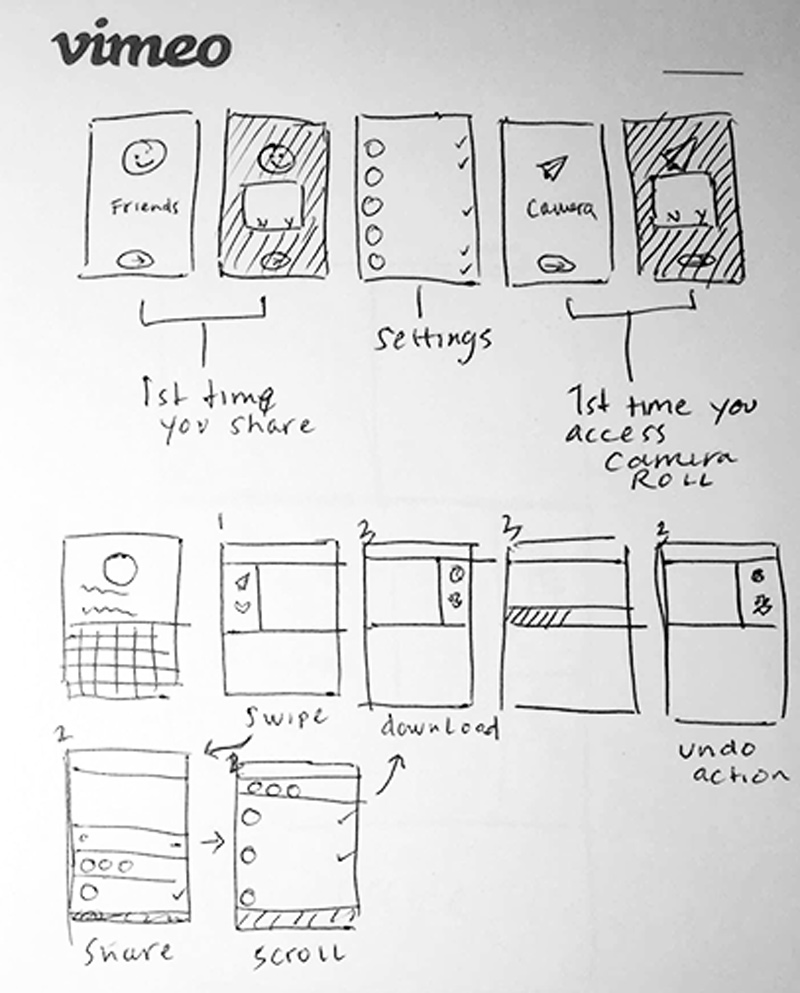
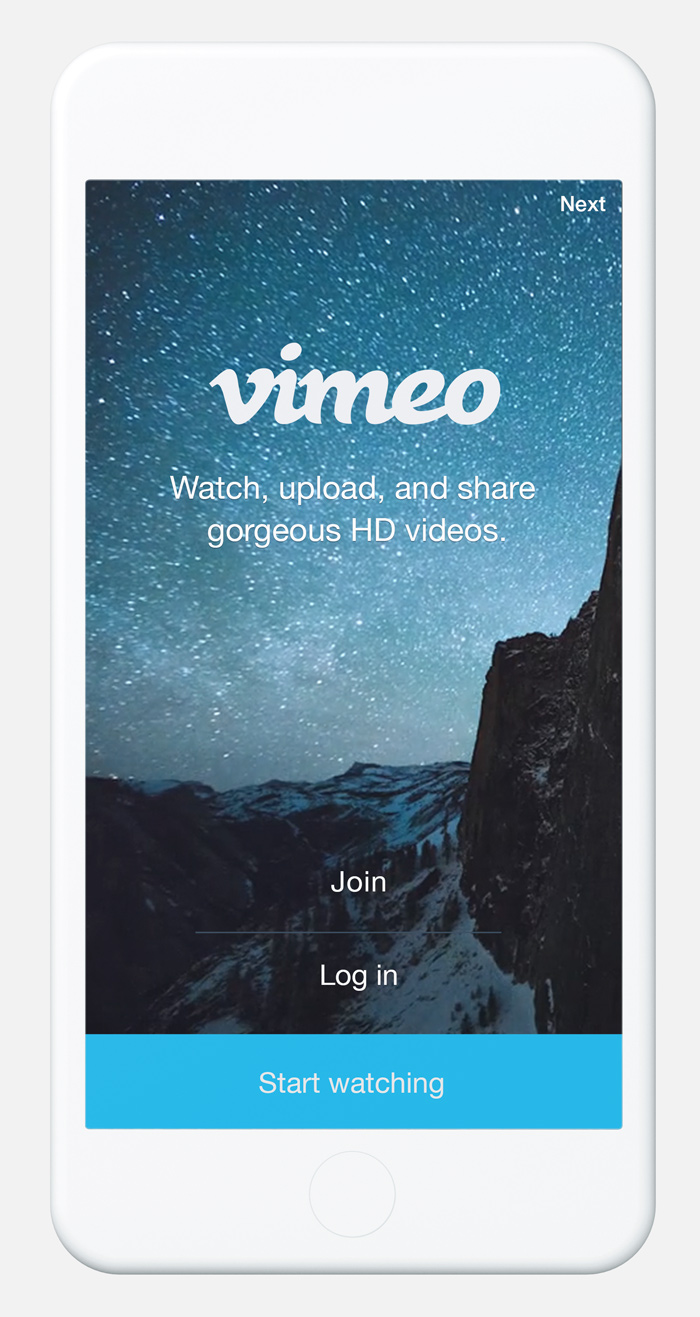
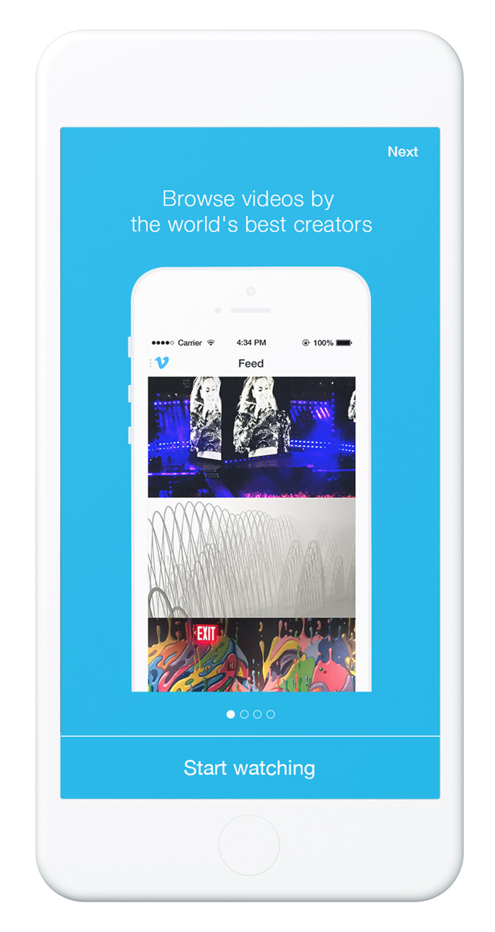
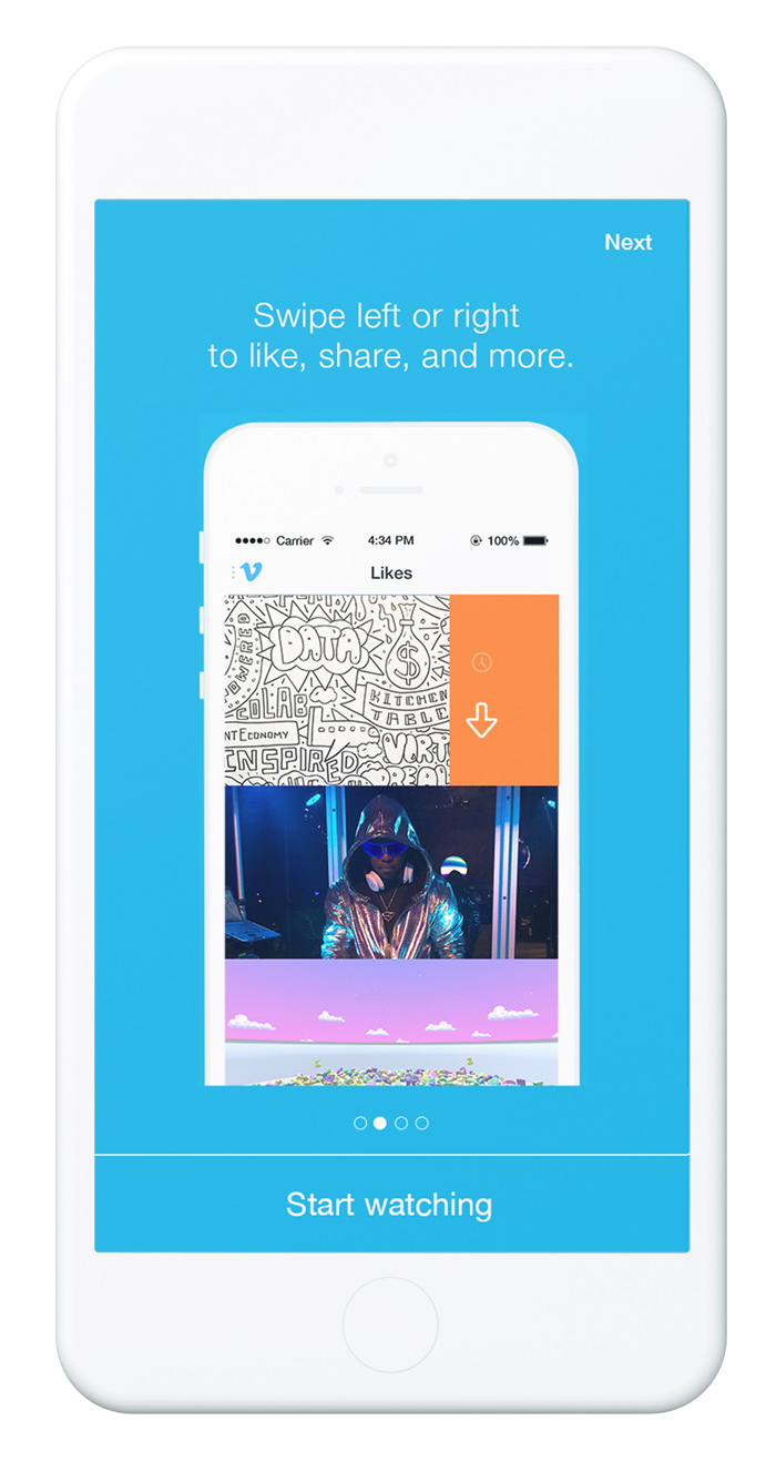
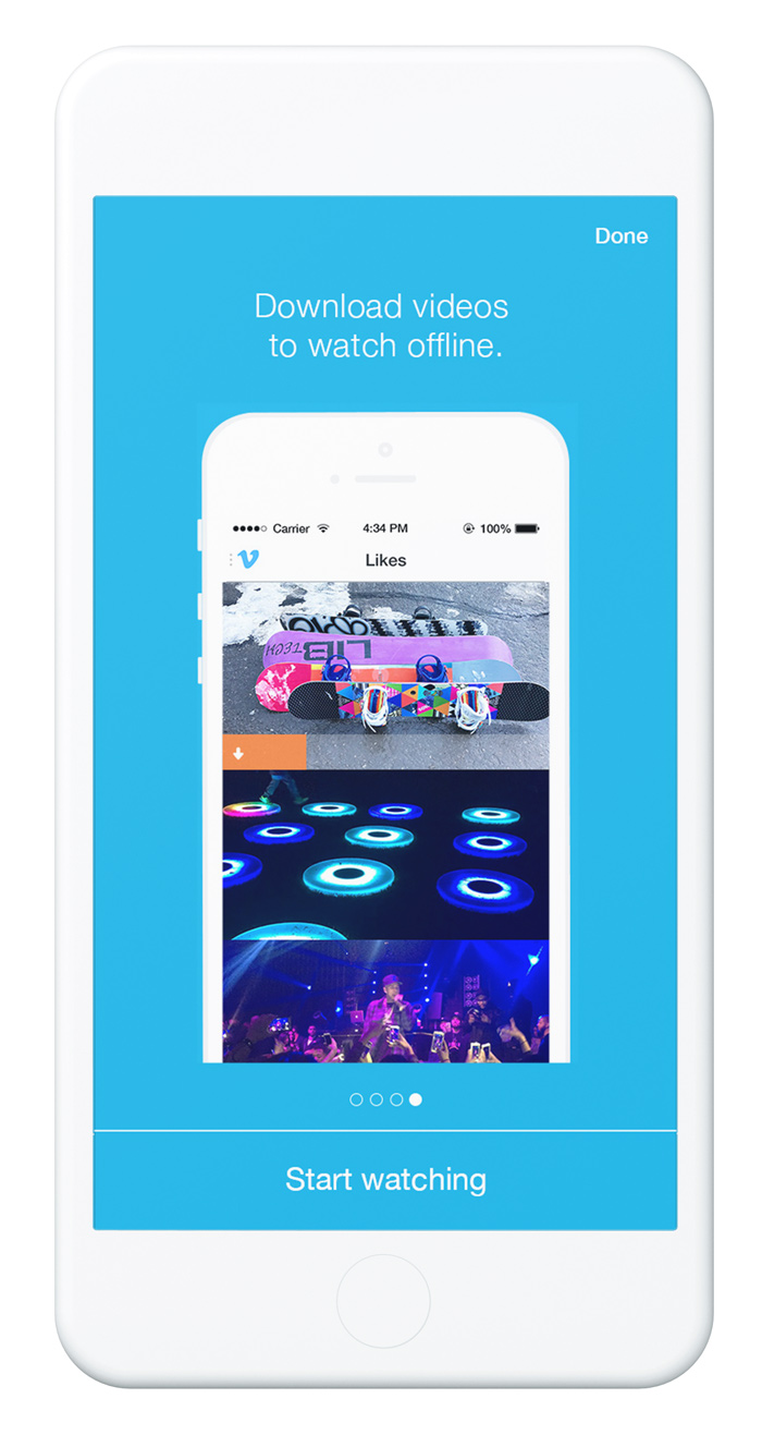
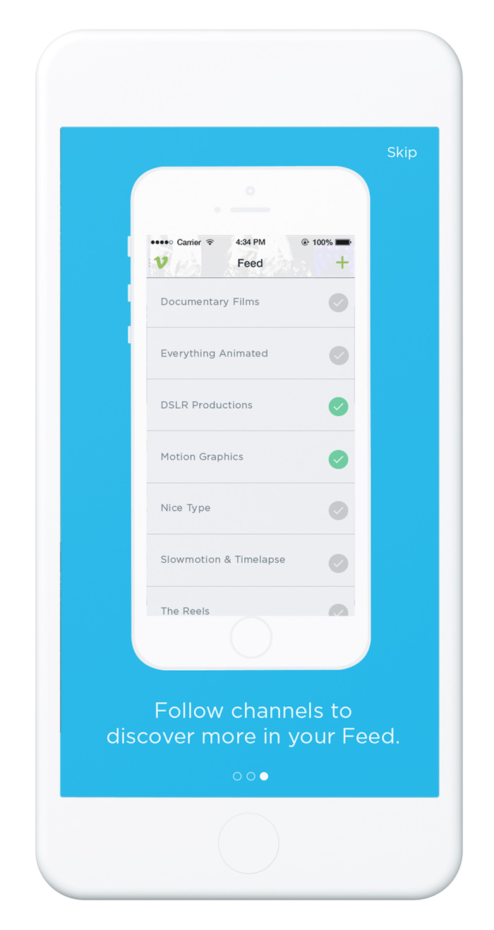
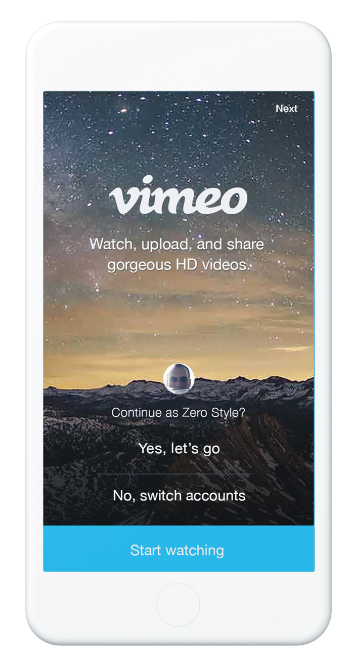
Onboarding tips
iOS update
Different feature flows

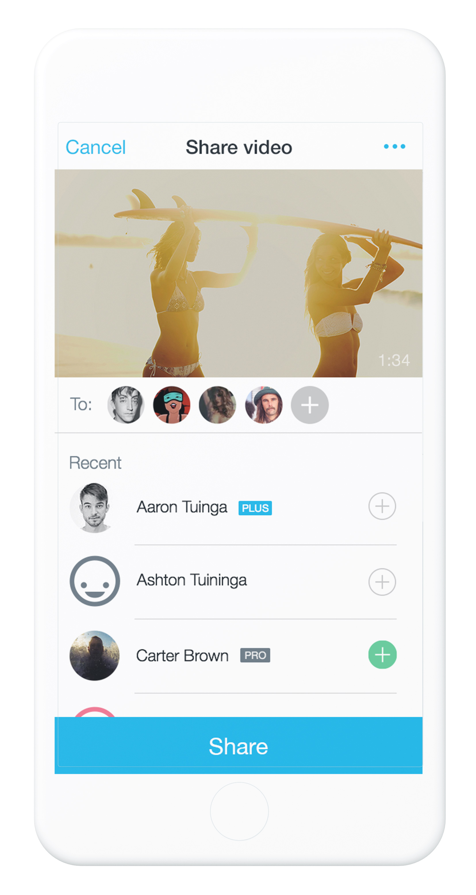
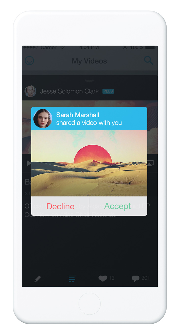
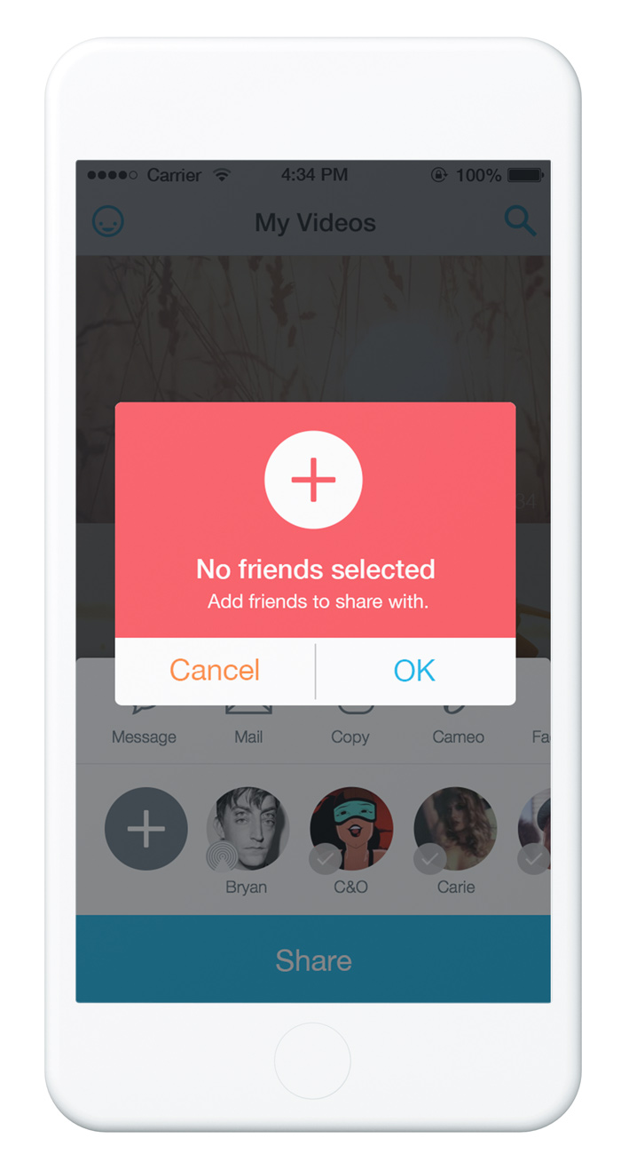
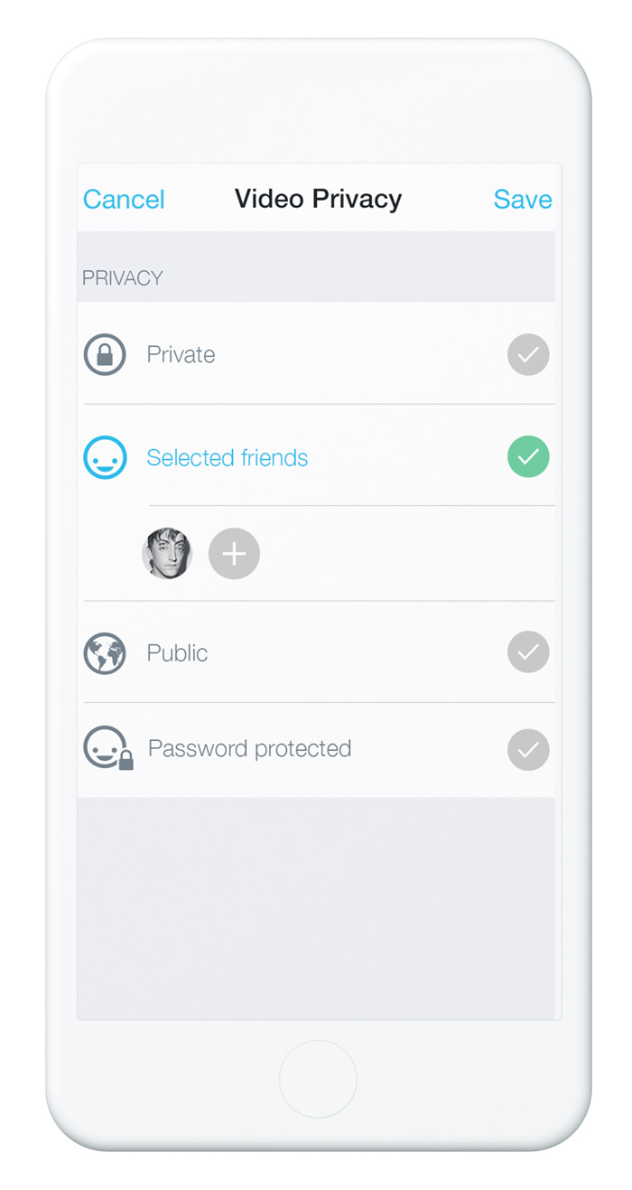
Use the share feature
Signup increase in the first month
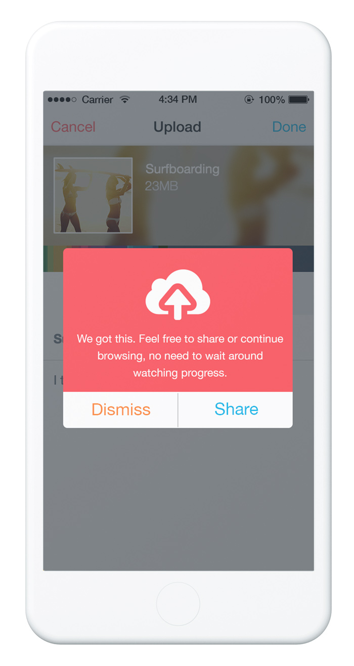
More mobile uploads

Increase in amount of videos viewed
Increase in mobile users
Less confused iTunes comments
Increase in time spent in app